SkyART Visual Rebrand
Logo & visual identity system, marketing design, photography
SkyART is a non-profit organization known for its free arts programming for kids, teens, and young adults on Chicago’s South and West Sides.
The assets requested by SkyART’s team included a variety of logos for the organization and its programs, a vast set of graphic assets to be used in their marketing collateral, templates for their team to create flyers and social media posts, and custom photography of their SkyWAY and Project 3rd Space programs.
Primary Logo
The goal for SkyART’s logo was to position the organization within the contemporary art world.
Taking subtle inspiration from what you may see when looking up at the sky, the “y” resembles a kite being flown by the letter “A” below. The askew letters set in the typeface Gellix by Displaay Type Foundry evoke strength and confidence while also embracing a sense of playful exploration. The logo includes variations including a horizontal version, one for each location (South & West), and a version that includes a cloud.


Video: SkyART Executive Director Devon Vanhouten-Maldonado reviewing an initial round of logo concepts.
Program Logos
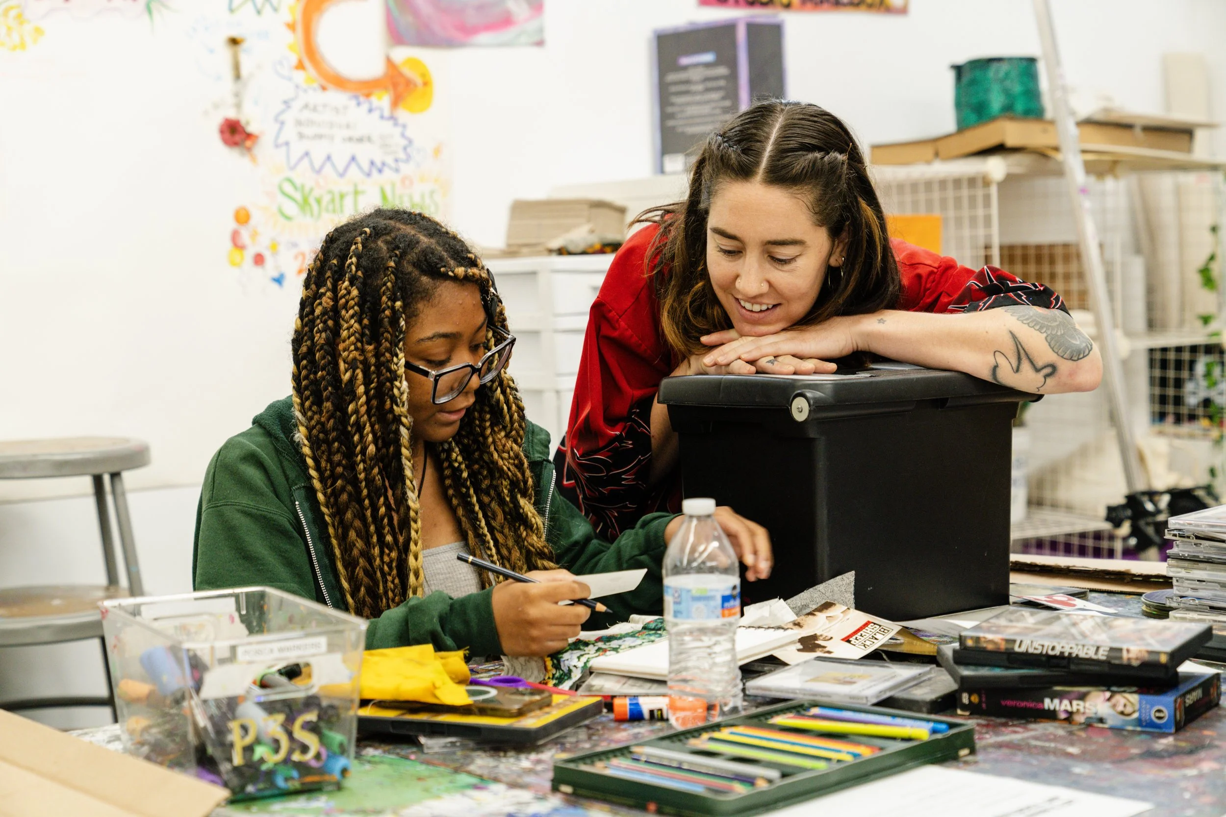
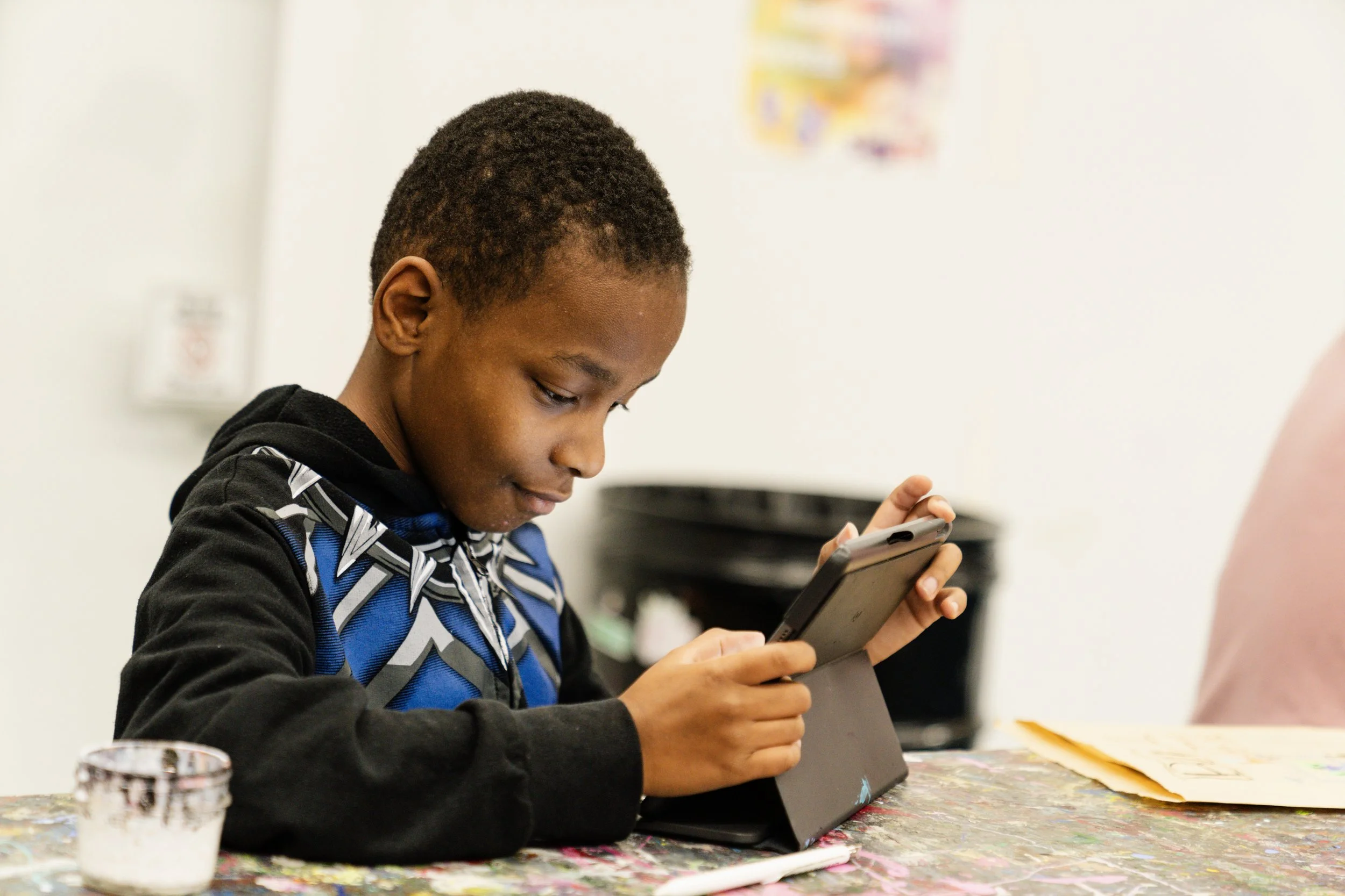
SkyART’s main programs include SkyWAY for youth ages 7-13, Project 3rd Space for teens, and Project Impact, their accessible art therapy program.
A logo was created for each unique program, along with its own color scheme.
Assets
These graphic assets include clouds, shapes, doodle marks, text, photography, borders, and background elements such as gradients, chunky shapes, and polka dots.
The entire asset library is stored in Canva, where SkyART’s marketing team can access and use with ease.
To simplify the process of designing communications materials and to maintain a consistent visual brand, a variety of graphic assets were created to use in flyers, Instagram posts, and more.


Photography
Included in SkyART’s branding package is a set of photography taken during their SkyWAY and Project 3rd Space programs.


A selection of photos edited to be used alongside the graphic assets above. Their black and white halftone pattern adds texture and personality to the visual brand.